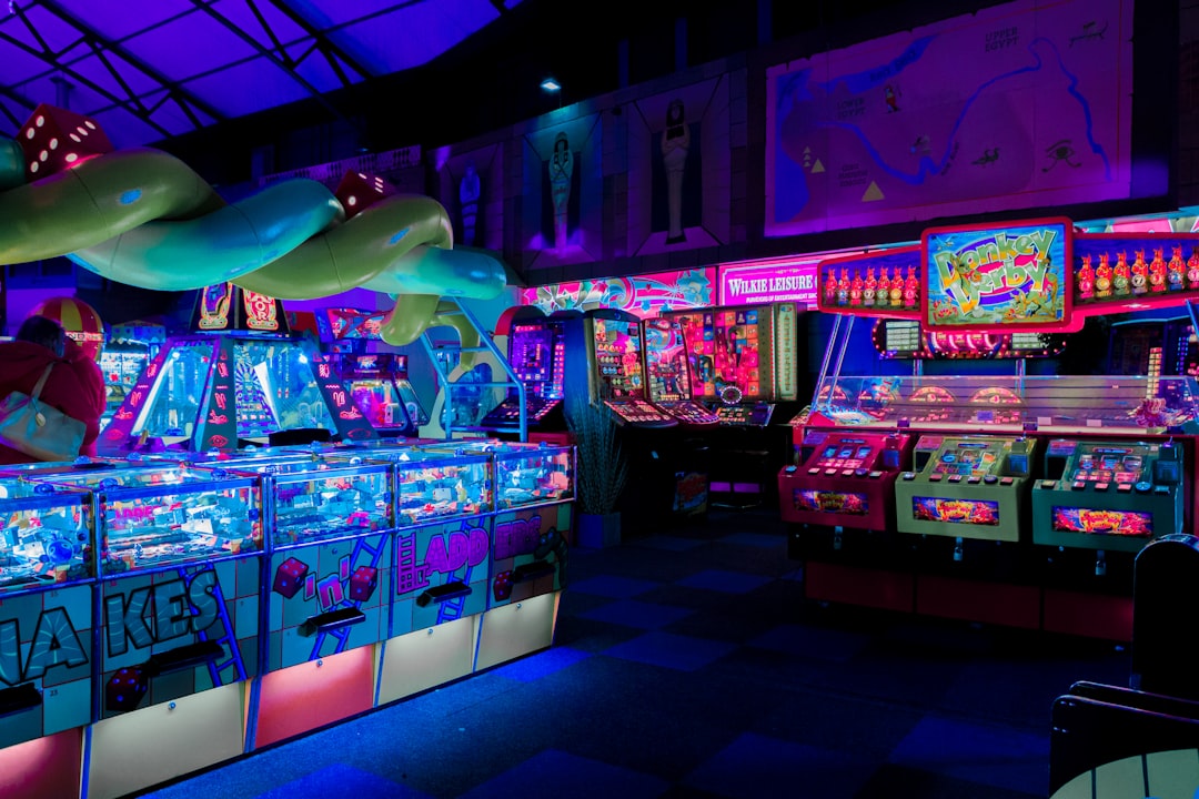
The leaked PS5 dashboard beta is interesting for one reason beyond the usual “new UI hype”: it spotlights how much friction still lives inside game menus. The best home screens don’t just look slick; they help players get back into play faster, understand what each button does, and stay confident even when they’re half-awake after a long session. That’s exactly why the PS5 dashboard is such a useful reference point for any studio thinking about game UI tips, menu navigation, onboarding UX, and controller-first design.
For browser gaming portals and instant-play libraries, this matters even more. When players arrive at a catalog, they want a path that feels as smooth as the best console dashboards, not a maze of nested options and vague labels. If you’re building a discovery-heavy experience, studying the PS5 dashboard is also a great way to think about feature launch anticipation, personalized discovery, and why performance trust matters when every click competes with a player’s attention span.
In this deep-dive, we’ll use the leaked PS5 dashboard as a springboard to break down practical UI patterns any game menu should steal. We’ll cover speed, clarity, controller ergonomics, microcopy, onboarding, retention loops, and the subtle psychology of making menus feel welcoming instead of exhausting. You’ll also get concrete examples, a comparison table, pro tips, and an FAQ you can use as a checklist for your own menu optimization work.
1) Why the PS5 Dashboard Works as a UX Benchmark
It reduces decision fatigue before the game even starts
Great dashboards don’t just organize content; they reduce the cognitive load of choosing what to do next. The PS5 dashboard beta leak suggests a cleaner hierarchy, which is important because players often arrive with one goal: resume, launch, or discover quickly. A cluttered menu can make even a great game feel like homework, and that’s one of the fastest ways to increase churn. Good dashboards, like good storefronts, should behave like a smart host rather than a noisy hallway.
This same principle shows up in other high-competition interfaces, from trusted directories to mobile game mechanics that keep players moving with minimal friction. The lesson is simple: show the next best action, not every possible action. When players can scan a menu and immediately understand what matters, they stay in the flow.
It treats the controller as the primary input, not an afterthought
Console UI lives or dies on controller-first design. That means focus states must be obvious, navigation paths should be predictable, and button prompts need to be consistent enough that players stop reading them and start feeling them. If a menu is built like a mouse-first web app, every action becomes a tiny negotiation. If it is built for a controller, inputs become muscle memory.
Studios can borrow from loadout drafting logic, where selection order and ranking reduce uncertainty, and from sound design, where tiny cues reinforce a user’s sense of control. The best dashboards feel almost invisible because they react exactly when the player expects them to. That’s the UX equivalent of a perfectly timed parry.
It makes “resume” and “discover” equally easy
Retention is not only about pushing players back into the same game; it’s also about helping them find the next one. The strongest dashboard patterns balance continuity and novelty, letting players resume last session, jump to recent content, or branch into discovery with almost no resistance. That balance matters for live-service games, arcade portals, and browser-based hubs alike. Players who feel in control are more likely to return tomorrow.
This is where the PS5 dashboard becomes a useful model for game discovery ecosystems and curated portal design. A strong home menu is part launcher, part recommendation engine, and part confidence builder. If your interface can do those three jobs in under five seconds, you’re already ahead of most menus in the wild.
2) Faster Navigation Is a Retention Feature, Not Just a Convenience
Reduce the number of steps to first play
Every extra tap between “I want to play” and “I’m in the game” is a retention tax. Players don’t think in screens; they think in momentum. The PS5 dashboard’s appeal lies in its effort to compress common actions into fewer moves, and game menus should do the same with clear shortcuts, sticky recent items, and predictable content grouping. If a player has to hunt for the start button, your menu has already lost points.
That’s why onboarding UX should be designed like a fast lane, not a tutorial wall. Borrow this mindset from helpful search experiences, where the goal is to narrow options quickly without making the user feel trapped. The menu should feel like it knows where the player is going before they say it out loud. That kind of responsiveness is what creates “one more round” behavior.
Use hierarchy to make frequent actions unavoidable
Navigation gets faster when the most common tasks occupy the most visible real estate. For game menus, that usually means play/resume, friends/party, daily rewards, challenges, and settings. Secondary actions can still exist, but they should never fight for visual attention with the primary loop. The PS5 dashboard-style approach puts the highest-value task in the easiest-to-reach position, which is exactly what a control-driven interface should do.
There’s a useful analogy in game night curation: the best picks are featured first because choice overload kills momentum. Likewise, a menu with a strong top layer lowers the mental cost of starting. Great hierarchy doesn’t hide content; it sequences it.
Make context persistent so users don’t re-learn the interface every session
Persistent context is one of the most underrated UX wins. If players return to the same mode, the same friend group, or the same challenge board, the interface should remember that context and make it the default. This is a major reason console dashboards feel smoother than many in-game menus: they preserve state better. Memory in UI reduces repetition, and repetition is the enemy of return visits.
For a portal like crazygames.site, this means remembering recently played titles, preferred genres, and even whether the player is browsing solo or with friends. Think of it like a well-run collaboration tool: the system should know what room you were in, what you were doing, and what to surface next. That’s not just convenient—it’s sticky.
3) Microcopy: Small Words, Big Impact
Replace vague labels with action-oriented language
Microcopy is one of those design details people only notice when it’s bad. Labels like “Options,” “Extras,” and “More” force players to guess, while action-led wording tells them exactly what they’ll get. The PS5 dashboard’s clarity is a reminder that menus should speak like a helpful co-op teammate, not a cryptic manual. If the wording is obvious, the user can spend their attention on play rather than interpretation.
In practice, this means changing “Continue” to “Resume Chapter 3,” “Load” to “Switch Save Slot,” or “Rewards” to “Claim Today’s Loot.” These are tiny edits with outsized effects because they remove ambiguity at the point of decision. For inspiration on making language feel targeted and timely, see how personalization transforms search results from generic to useful.
Use supportive microcopy to prevent abandonment
Players often quit menus not because they dislike the game, but because they hit uncertainty. Supportive microcopy can rescue those moments by explaining consequences, expected wait times, or what happens next. “You can change this later” lowers commitment anxiety. “No save data will be deleted” reduces fear. “Takes less than 10 seconds” makes a loading step feel manageable.
This is the same trust-building principle behind a strong trusted directory or a well-designed onboarding flow. People stay when they feel informed. They leave when they feel tricked.
Use delight sparingly, not everywhere
Fun copy has its place, but when every screen is trying to be witty, players stop receiving the message. The best dashboard-style interfaces use personality in the right moments: a victory toast, a reward unlock, a gentle nudge after inactivity. The main navigation should stay crisp. Let the game’s tone shine through, but never at the expense of speed.
That balance is similar to meta storytelling: cleverness works best when the audience still understands what is happening. Microcopy should support the task first and entertain second. If users remember the joke but miss the action, the UI has drifted off course.
4) Onboarding UX: Teach Without Interrupting
Layer learning into the interface instead of front-loading everything
Great onboarding doesn’t dump a rulebook on players. It reveals controls at the moment they’re needed, often in a subtle, contextual way. The leaked PS5 dashboard is useful here because modern console UX increasingly favors progressive disclosure over long explanations. This keeps the interface tidy while still helping first-time users succeed.
For browser games, onboarding should behave like a smart coach: show, then step back. A player entering a racing game might see a one-line tip about drift, while a puzzle game might surface only the undo shortcut. This is similar to how specialized hardware guides focus on the exact feature that matters most to the user. The trick is not giving more information; it’s giving the right information at the right time.
Make the first 30 seconds feel controllable
Retention research across games and apps consistently points to early success as a major predictor of long-term use. If the first 30 seconds feel confusing, punitive, or slow, many players bail before the fun loop starts. That’s why onboarding should prioritize one immediate action, one clear reward, and one obvious next step. The goal is confidence, not completeness.
Design teams can use ideas from launch pages to pace this moment like a trailer: hook, reveal, engage. In game menus, that translates to “start now,” “here’s what you can do,” and “here’s why it’s worth staying.” When onboarding is compact and respectful, players interpret it as competence rather than clutter.
Build skip paths for experienced users
Nothing kills expert satisfaction like being forced through beginner content they no longer need. Every onboarding flow should have a “skip,” “don’t show again,” or “fast path” for returning players. This matters because a good UI serves both new and returning audiences without making either group feel punished. The best menus adapt to user confidence rather than assuming everyone is starting from zero.
This principle echoes lessons from personalized search and AI-assisted discovery: users want relevance, not ceremony. If your menu knows who the player is and what they already understand, it can become dramatically shorter without losing usefulness. That’s a retention win disguised as simplicity.
5) Controller-First Design: Make Every Button Feel Intentional
Design for thumb travel, not just visual alignment
Controller-first design means thinking in motion, not just in layout. On a gamepad, the distance between focus targets matters because it affects flow and fatigue. If important actions are scattered, the player’s thumb has to work harder, and that friction becomes part of the experience. The PS5 dashboard succeeds because it makes common routes feel natural under the thumb.
This is especially important in menus with recurring use, like daily quests, loadout setup, or matchmaking screens. The best interfaces organize actions in an order that minimizes backtracking and diagonal jumps. If your menu feels like a shortcut map instead of a path, you’ve already improved usability.
Keep focus states loud, readable, and consistent
Focus states are the heartbeat of controller UX. They must be visually unmistakable without being obnoxious, and they should behave the same way from screen to screen. Consistency builds trust because players can predict the system’s response before pressing a button. Prediction equals comfort, and comfort keeps people engaged.
Good focus design is to menus what a clear loading cadence is to performance: it reduces anxiety. For more on maintaining polish without slowing things down, the tradeoffs in polished UI without performance loss are worth studying. A beautiful menu that feels sluggish is still a bad menu.
Map common actions to common expectations
Players expect certain buttons to do certain things, and violating that expectation creates instant friction. Confirmation, back, quick select, and menu overlays should be predictable across your entire interface. Don’t make players relearn your input schema every time they open a new panel. The fewer exceptions you create, the easier the interface becomes to master.
Studios often think novelty is impressive, but in UI, familiarity is usually the smarter flex. It’s similar to how fantasy drafting systems work best when rankings feel intuitive and stable. A menu that respects standard controller logic is easier to trust, and trusted interfaces keep players coming back.
6) Menu Optimization for Retention: Turn Navigation into a Habit Loop
Use the dashboard as a daily touchpoint, not a dead-end
A dashboard should be more than a launcher. It should create a habit loop: arrive, recognize, act, reward, return. That loop is what turns an ordinary menu into a retention engine. The PS5 dashboard beta matters here because it signals an evolution toward a home screen that feels more like an activity hub than a static grid.
For game portals, that means surfacing daily challenges, streaks, tournaments, and quick resume paths without overwhelming the player. Community features can also live here, especially when they tie to immediate action. If a player sees a friend’s score, a leaderboard milestone, or a limited-time event, the menu becomes socially alive instead of purely functional.
Connect discovery to progression, not just novelty
Discovery is stronger when it serves player identity. Instead of merely showing “trending,” show “trending for platformer fans,” “new games like the one you finished,” or “challenge runs you can clear in five minutes.” This type of contextual personalization makes the dashboard feel smart rather than random. It also helps reduce churn by ensuring the player always has a plausible next move.
That approach mirrors the logic behind curated deal pages and price-aware recommendation engines: relevance increases action. A menu that understands what kind of player is standing in front of it is much more likely to convert curiosity into play. And play is the product.
Reward return visits with visible momentum
Return visits get stronger when the menu shows what changed since last time. New missions, freshly unlocked cosmetics, community highlights, and progress markers all create a feeling of momentum. Players like walking into a space that remembers them and has something waiting. That emotional cue can be more effective than a flashy banner.
Think of it like a live event feed, similar to principles from one-off gaming events. Scarcity and freshness both trigger curiosity. When menus reflect real change, they stop feeling like static software and start feeling like a living part of the game.
7) What Game Menus Should Steal from the PS5 Dashboard, Line by Line
Priority-based layout beats feature dumping
One of the clearest dashboard lessons is that the first screen should answer the player’s most likely question instantly. What am I doing now? What’s next? What’s new? A menu that can answer those three questions without extra taps is already doing most of the job. This is especially useful in games with many subsystems, where feature creep can quickly bury the actual fun.
A useful comparison can be seen in how cloud gaming decisions are framed: the best guide doesn’t list every technical detail upfront, but prioritizes the decision criteria that matter most. Menus should behave the same way. Lead with relevance, then let the details unfold.
Motion and spacing can signal importance
Animation isn’t just decoration; it can teach hierarchy. Subtle motion helps players understand what just happened, what changed, and where their attention should go next. The best dashboard motion feels almost like a guide rail, gently steering the eye without turning the interface into a screensaver. Too much motion, on the other hand, creates laggy vibes even when the system is fast.
That idea also appears in visual marketing: movement attracts attention, but only when it supports the message. In menus, motion should clarify state changes, not compete with them. The moment animation becomes a delay, it stops being UX and becomes theater.
Accessibility and comfort should be visible, not hidden
Accessibility features are strongest when they’re easy to find before players need them. Text size, color contrast, input remapping, subtitle toggles, and reduced motion settings should be surfaced early and often. That does not mean turning the menu into a settings workshop; it means building a more welcoming default path for everyone. Good comfort settings reduce drop-off for players with different needs and preferences.
This aligns with broader lessons from mobile security UX and wearable tech interfaces: the best systems make safety and usability feel built in. In games, accessibility is not an optional add-on. It is part of the product experience.
8) Comparison Table: Console-Style vs. Weak Game Menu Design
Below is a practical side-by-side comparison of what to copy and what to avoid when optimizing your own game menus.
| UX Area | Console-Style Strength | Weak Menu Pattern | Retention Impact |
|---|---|---|---|
| Navigation | Few steps to resume or start | Deep nested categories | Higher completion, less abandonment |
| Microcopy | Action-led, specific labels | Vague terms like “More” or “Extras” | Fewer misclicks, more confidence |
| Controller UX | Clear focus states and button consistency | Unpredictable button behavior | Lower frustration, better mastery |
| Onboarding | Contextual tips, progressive disclosure | Long intro tutorial dump | Better first-session survival |
| Discovery | Personalized, relevant recommendations | Generic trending content only | More return visits and clicks |
| Performance | Fast transitions, low-latency interaction | Heavy effects and slow loading | Higher trust, less churn |
This table is the shorthand version of the entire article: good menus are clear, fast, context-aware, and respectful of the player’s time. Bad menus ask for attention before they’ve earned it. Once you see the difference, you can’t unsee it.
9) Practical Menu Optimization Checklist for Studios and Portals
Audit the top three tasks first
Start by identifying what the majority of users do in their first 30 seconds. In most games, it’s resume, start, or find something new. In portal environments, it may be browse, filter, or launch a recommended title. If those tasks are not immediately obvious, redesign the entry layer before touching anything else.
This same top-task-first thinking powers efficient SEO audits, where the highest-impact fixes come first. It’s a smart way to avoid polishing the wrong part of the experience. Improve the path that the most people use, and the whole system feels faster.
Instrument friction, don’t guess at it
Analytics should tell you where players hesitate, backtrack, or abandon the menu. Track screen-to-screen movement, selection dwell time, and the points where users most often exit. Those are the places where copy, hierarchy, or speed may be failing. If you can’t see the friction, you’ll keep blaming “player behavior” for a UI problem.
For teams that like process, this is similar to operations checklists: reliability comes from knowing what to monitor. Menus are systems, not posters. Measure them like systems.
Test with real controllers and real players
Touchpad simulations and keyboard testing can only take you so far. The real truth appears when someone leans back on a couch, grabs a controller, and tries to navigate under mild distraction. That’s when you learn whether the focus states are clear, the prompts are readable, and the structure actually feels good. A menu should survive real-world conditions, not just lab conditions.
Gather feedback from different player types too: casual, competitive, accessibility-focused, and completionist. Their needs will diverge, and that’s useful. The best optimization plans are built from multiple play styles, not one ideal user persona.
10) The Bigger Lesson: Menus Are Part of the Game
UI is not overhead; it is part of the emotional contract
Players don’t separate the menu from the game as much as studios assume. If the menu feels smart, the game feels more polished. If the menu feels clumsy, the game feels heavier before the first enemy even appears. This is why dashboard UX is a retention issue, not just a visual design choice.
In the same way that sports narratives and fan communities shape how audiences experience an event, menus shape the emotional tone of a game session. A good interface says: you’re welcome here, and we’ve got you. That feeling keeps people playing.
Simple menus respect player energy
Players spend plenty of energy inside the game itself. The interface shouldn’t demand extra energy just to participate. Every screen should conserve attention by making the next step obvious and the current state readable. That’s the hidden genius of the best dashboards: they lower the cost of entry while increasing the sense of control.
If there’s one final takeaway, it’s that menu optimization is really experience design in disguise. Make it faster, make it clearer, make it more contextual, and make it controller-first. Do that, and the PS5 dashboard stops being just a leaked beta curiosity and becomes a blueprint for better games.
Pro Tip: If you can remove one menu screen without removing meaning, do it. Shorter paths almost always outperform prettier dead ends.
FAQ
What is the biggest lesson game menus can learn from the PS5 dashboard?
The biggest lesson is to reduce friction. The best dashboards make common actions immediate, keep the hierarchy clear, and use the controller as the primary design lens. That combination helps players move faster and feel more confident.
How does microcopy affect player retention?
Microcopy reduces uncertainty. Clear, action-focused labels and supportive prompts make players feel safe and informed, which lowers abandonment and improves the chance they’ll continue into gameplay.
Why is controller-first design so important?
Because most players on consoles navigate with a gamepad, not a mouse. Controller-first design ensures focus states, spacing, and button mappings feel intuitive, which reduces frustration and improves speed.
What should onboarding UX avoid?
It should avoid long tutorial dumps, forced explanations, and early interruptions. Onboarding works best when it teaches in context, lets experienced users skip ahead, and gets players into a successful first action quickly.
How can a browser game portal improve menu optimization?
By surfacing recent games, personalized recommendations, visible shortcuts, and clear labels. Fast load times, strong hierarchy, and contextual prompts can make a portal feel as smooth as a polished console dashboard.
What’s the easiest win for teams with limited design resources?
Improve the top three user actions first: start, resume, and discover. Tightening those paths usually delivers the biggest retention lift with the least amount of redesign.
Related Reading
- Liquid Glass vs. Battery Life: Designing for Polished UI Without Slowing Your App - Great for balancing visual flair with performance.
- The Future of Personalization in Search: Opportunities for Cloud Hosting Vendors - A useful lens on smarter recommendations and relevance.
- Maximize the Buzz: Building Anticipation for Your One-Page Site’s New Feature Launch - Learn how to stage reveal moments that grab attention.
- Subway Surfers City: Game Mechanics That Influence Development Patterns in Mobile Games - Useful for understanding habit loops and repeat engagement.
- Conducting an SEO Audit: Boost Traffic to Your Database-Driven Applications - A practical model for auditing menu friction like a system.