If you’ve ever judged a wine by its label, a board game by its box cover, or a book by its jacket art, you already understand the core idea behind store thumbnails: presentation changes behavior. On a busy game portal, your store thumbnail is the digital shelf-facing package, and your banner is the endcap display. In a world where players scroll fast, compare faster, and click only when something feels instantly legible, packaging psychology is no longer a “nice-to-have” for game marketing—it’s the conversion engine.
This guide breaks down how to turn game thumbnails into click-ready mini-packages using the same principles that make wine labels, board game boxes, and retail display posters work. We’ll cover the power of a well-designed label, box, or cover, plus practical UI/UX, thumbnail composition, typography, color, and microcopy strategies you can use for indie discoverability, wishlists, and long-term audience growth. If you want your game to stand out in a crowded feed, this is your playbook.
1) Why Thumbnails Behave Like Packaging in the First Place
People don’t scan stores linearly; they browse emotionally
Packaging wins because it must communicate under extreme time pressure. A shopper standing in front of a shelf gives a label a few seconds, not a full minute, and the same is true online where users flick through tiles in rapid bursts. That’s why a good thumbnail isn’t just “pretty”—it’s a compressed sales pitch that answers, “What is this, and why should I care?” before the player’s thumb moves on. Strong visual design creates instant confidence, which is the first step in conversion optimization.
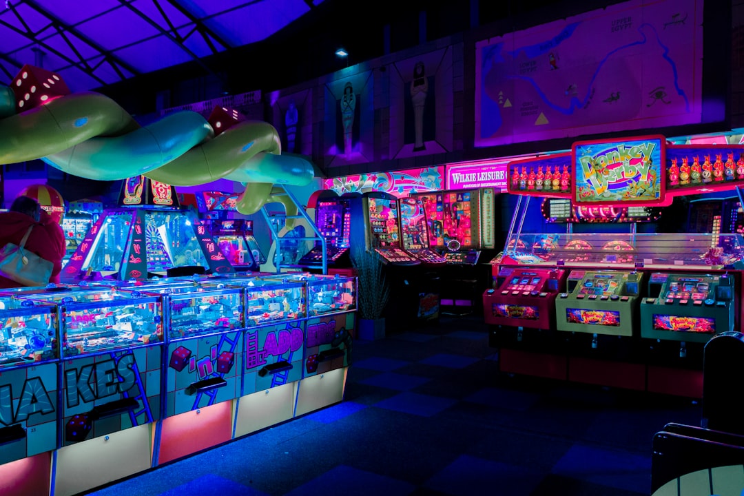
The connection to board games is especially useful. A tabletop box has to look compelling from several distances and angles, and publishers obsess over whether the title, iconography, and subject matter read clearly in a store or in a tiny online card. That exact challenge is shared by game portals, because your thumbnail has to work at multiple sizes: in a featured row, a search result grid, a mobile carousel, and a wishlist preview. The best thumbnail best practices borrow from packaging by making one central promise and supporting it with a clean hierarchy.
For more insight into how presentation shapes desire, it helps to look beyond games. retail display posters that convert rely on the same logic: fast visibility, minimal clutter, and one dominant focal point. The more your visual system resembles a product package instead of a marketing collage, the more easily players can decode it. That is the foundation of click-through performance.
Thumbnail decisions are often made before conscious analysis
Wine label research has long suggested that packaging can dominate decision-making, and the source article notes a widely cited stat that over 80% of wine buyers may choose largely based on the label. Whether the precise number varies by study, the bigger truth is stable: people use visuals as cognitive shortcuts. In games, that shortcut is even stronger because players are often choosing among dozens of similar-looking titles with limited context. If your thumbnail does not create an immediate category signal, it becomes invisible.
This is why game marketing cannot treat thumbnail composition as an afterthought. The frame, color fields, contrast, typography, and subject placement are all part of a visual argument. Good packaging doesn’t merely “show the thing”; it frames the thing in a way that suggests taste, quality, and fit. If you want your store thumbnail to do the same, you need to design for recognition, not just art appreciation.
Pro Tip: A thumbnail should communicate genre, mood, and quality in under one second. If it takes longer, the user is already halfway to the next tile.
Browser-game portals have a unique advantage: instant testability
Unlike physical packaging, game store thumbnails are highly measurable. You can run design experiments on first impressions and see how changes affect clicks, wishlists, and session starts almost immediately. That makes thumbnails one of the highest-leverage assets in the entire marketing stack. If your portal has trending rows, featured placements, and genre hubs, every visual variant becomes a live A/B test.
This is especially valuable for indie discoverability, where small presentation improvements can create outsized gains. A tiny shift in title placement or a more readable color palette can move a game from “scroll past” to “open now.” Think of it like refining a product box after watching it sit on the shelf in a store: the best version is the one that gets picked up. On the web, that means clicked, wishlisted, shared, and replayed.
2) Thumbnail Composition: Build a Mini-Billboard, Not a Collage
Use one hero subject and a clear focal path
The fastest way to kill thumbnail performance is to cram in too many ideas. A store thumbnail is not a montage poster, and it is definitely not a scrapbook. Instead, it should have one primary hero subject, one supporting narrative cue, and a strong focal path that guides the eye in a predictable route. This mirrors box art design, where a publisher wants you to spot the fantasy warrior, the sleek robot, or the expressive face before you notice the background details.
Ask yourself: if I shrink this to a tiny tile, what survives? If the answer is “not much,” the composition is too busy. A clean silhouette, bright face, oversized weapon, recognizable vehicle, or iconic environment all work because they are easy to parse instantly. This is the packaging equivalent of a strong brand mark—an image that can be recognized even when reduced to its smallest useful size.
For inspiration on structured visual storytelling, see designing short-form market explainers, where the same rule applies: one message, one focal point, no visual dead weight. Your thumbnail should be able to “speak” before the title is read. That is how you win the first half-second.
Leave breathing room for title and UI overlays
One of the most overlooked thumbnail best practices is composition that respects the platform. Your design may look beautiful in a mockup, but if the portal overlays a play icon, rating badge, or wishlist star, the key art can get crowded fast. Leave negative space where interface elements are likely to sit, and don’t place critical faces or text in areas that could be obscured. That small bit of discipline can dramatically improve legibility and perceived polish.
This is where packaging psychology becomes useful again. Great box art anticipates the shelf environment, the shrink wrap, the spine view, and the back-of-box scan. In digital stores, you need to anticipate cropping, responsive resizing, and dark-mode UI as well. The practical win is simple: the more flexible your art is, the more places it can appear without falling apart.
If you’re building a portfolio of featured placements, use a consistent framing system. Consistency makes your catalog feel like a premium line rather than a random assortment of tiles, which is especially helpful for musical marketing-style content structures that rely on pattern recognition and recall. A player who learns your visual language once is more likely to spot and trust the next release.
Show gameplay fantasy, not just ingredients
Players do not click because a thumbnail showcases technical features in a sterile way. They click because the visual sells a fantasy: being a detective, surviving a dungeon, building a city, or laughing at chaos with friends. Box art succeeds when it captures the emotional destination, and thumbnails should do the same. That means foregrounding the moment of play rather than a generic logo on a flat background.
When in doubt, ask what the screenshot or key art promises emotionally. Does the image suggest speed, mastery, mystery, co-op mischief, or cozy discovery? The best art is not merely descriptive; it is aspirational. That’s why many publishers spend disproportionately on box illustration, and it’s why thumbnails deserve the same attention in game marketing.
3) Typography, Readability, and the “Label on the Bottle” Problem
Typography is your fastest trust signal
Typography in a thumbnail functions like a wine label’s type system: it tells the viewer whether this is elegant, playful, premium, chaotic, or cheap. A weak font choice can undercut even excellent art because the brain reads inconsistency as lower quality. In a browser game portal, the title must be legible at small sizes and harmonize with the visual tone of the game. If the type is too ornate, too thin, or too compressed, the thumbnail loses authority.
Good typography also supports accessibility. Thick strokes, strong contrast, and simple letterforms help players on phones, tablets, and low-end displays. That matters because many users are browsing on small screens while multitasking, in dim light, or with motion scrolling. The more readable your title, the fewer cognitive barriers between interest and click.
For adjacent design thinking, look at clinical decision support UI patterns, where trust and explainability depend heavily on clear labels and hierarchy. While games are far more playful, the core principle still applies: clarity builds confidence.
Hierarchy beats decoration every time
Most thumbnails fail because every element screams equally loud. When everything is emphasized, nothing is emphasized. Instead, create a clear hierarchy: first the hero image, then the game title, then one or two supporting cues such as genre, mode, or progression hook. This is the visual equivalent of a well-written product label that helps a customer understand at a glance what they are about to buy.
Hierarchy should be built with size, contrast, placement, and whitespace—not with extra clutter. If the title needs to be small to fit, the overall art direction may be too busy. If you need multiple badges to explain the concept, the core concept may not be sharp enough. A great thumbnail communicates with fewer words because it has made the right design decisions upstream.
That’s also why there’s a strong connection to smarter listing descriptions: the best product pages reduce friction by surfacing the right detail at the right time. For thumbnails, the “right detail” is the one that turns curiosity into a click.
Microcopy can rescue a good image and save a weak one
Microcopy is the tiny text that helps a player understand the offer in a flash: “Co-op chaos,” “Daily challenge,” “New today,” “PvP arena,” or “Story-rich roguelike.” Used wisely, it acts like a label on a bottle that promises flavor before the first sip. Used badly, it becomes noise. The trick is to make microcopy specific enough to inform but short enough to remain invisible unless needed.
Game portals can use microcopy to reduce uncertainty and increase wishlist intent. A player who sees “Short sessions” on a stealth game may click because they know it fits a lunch break. A banner that says “Play instantly, no install” removes a common objection. These are small phrases, but they perform a big job: they translate art into expectation.
4) Color Psychology: Make the Shelf Pop Without Searing the Eyes
Contrast drives speed, but color drives mood
Color is doing two jobs at once. First, it helps the thumbnail stand out against the surrounding interface. Second, it tells the player what emotional lane the game lives in. Bright, saturated palettes can signal arcade energy, celebration, or comic mischief, while muted tones may suggest atmosphere, strategy, or narrative depth. The best visual design uses color to differentiate without overwhelming.
The mistake many teams make is assuming “more color equals more clicks.” Not necessarily. A thumbnail can be colorful and still collapse into visual mush if all hues compete at the same intensity. What matters is intentional contrast: one dominant palette, one accent color, and a controlled amount of detail. That’s how packaging on shelves works too—quiet where needed, loud where it counts.
A useful adjacent comparison is poster visibility strategy, which emphasizes pop, distance readability, and quick campaign turnaround. In game portals, you need the same thing, only at smaller scale and faster velocity.
Match color to genre expectations, then add one twist
Players have learned visual conventions. Horror leans into dark contrast and tension colors, cozy games often use warm palettes and soft lighting, and competitive titles favor high-energy color blocking. If your thumbnail fights the genre completely, players may misread the promise and bounce. But if you only follow convention, your store can become visually flat and forgettable.
The sweet spot is “familiar plus distinctive.” Use the expected genre language so the game is instantly understandable, then add one surprising accent to make it memorable. That might be an unusual hero color, a bright prop, or a uniquely framed scene that creates identity. Think of it like a label design that respects category norms while still making shoppers stop and take a second look.
For broader psychology on perception and recognition, the psychology of celebrity influence offers a helpful reminder: people are drawn to the familiar signal before they rationalize the choice. Thumbnails work the same way—recognize first, explain later.
Beware color blindness and mobile washout
Any serious thumbnail optimization workflow should include accessibility checks. Reds and greens may separate beautifully in an art director’s monitor view, but they can collapse for color-blind users or lose punch under mobile compression. Test your art in grayscale, in small-size previews, and on both light and dark UI backgrounds. If the design still reads in those conditions, it is resilient.
This matters because game stores are increasingly consumed on-the-go. A player may be scanning a portal in a train station, on a low-brightness phone, or while watching a stream on another monitor. The more robust the contrast and silhouette, the better your conversion rate tends to hold across contexts. Durable thumbnails outperform fragile ones.
5) A/B Testing: Treat Every Thumbnail Like a Live Experiment
Test one variable at a time
A/B testing is where thumbnail design becomes a scientific discipline rather than a matter of taste. If you change the art, title treatment, background, and microcopy all at once, you’ll never know what actually improved performance. Instead, isolate one variable: composition, color, text placement, or callout phrasing. This is the only way to build repeatable learning.
Think of your thumbnail as a product page headline in visual form. The goal is not to create the “best art” in the abstract. The goal is to maximize a measurable outcome such as clicks, wishlists, play starts, or return visits. If one version wins on click-through but loses on retention, you may have optimized the wrong promise, which is why downstream metrics matter.
For teams that want a structured process, data-driven content calendars are a useful mindset model: decide what you want to learn, schedule the test, and review the result in context rather than emotionally.
Measure more than clicks
Clicks are important, but they can lie. A flashy thumbnail may attract curiosity while failing to convert into sustained engagement. The smarter approach is to track the full funnel: impressions, CTR, wishlist adds, play starts, average session length, and repeat visits. That way, you can tell whether your thumbnail is attracting the right audience or merely attracting everyone.
This is especially important for indie discoverability, where a game may benefit from a narrower but better-matched audience. A thumbnail that overpromises can create bounce; a thumbnail that accurately telegraphs the experience can create stronger player satisfaction. In other words, the purpose of design is not just to get the click—it is to get the right click.
For a strong analogy outside games, see community deal tracker behavior, where social proof influences what people investigate first. In your store, that means the visual must earn the click and then survive the session.
Build a repeatable test matrix
To make thumbnail testing operational, create a simple matrix with rows for each game and columns for art focal point, title size, background contrast, badge usage, and microcopy. Then log the hypothesis and the result. Over time, you’ll begin to see patterns: maybe close-up character faces win for action titles, while environment shots win for puzzle games. Those insights become an internal playbook, not just one-off wins.
You can even borrow thinking from product-finder tools: reduce choice overload by standardizing templates, then customize within a controlled system. That keeps your creative team fast without sacrificing experimentation.
| Thumbnail Element | What It Does | Common Mistake | Best Practice | Testing Signal |
|---|---|---|---|---|
| Hero subject | Creates instant recognition | Too many characters or props | One dominant focal point | Higher CTR in cold traffic |
| Typography | Signals tone and clarity | Thin, ornate, unreadable fonts | Bold, legible, brand-consistent type | Lower bounce on mobile |
| Color palette | Sets mood and shelf pop | Over-saturated visual noise | One dominant palette with accent contrast | Better stop rate in grids |
| Microcopy | Clarifies the offer | Generic or repetitive labels | Specific benefit or mode cue | Improved wishlist adds |
| Negative space | Supports UI readability | Important elements cut off | Reserve space for overlays and crops | More consistent performance across placements |
6) Indie Discoverability: Make Small Games Feel Shelf-Ready
Thumbnail polish can act like social proof
Indie games often compete against bigger budgets, louder brands, and more familiar IP. That makes visual polish a kind of credibility signal. When a thumbnail looks thoughtful and professional, players subconsciously infer that the game itself has been cared for. This is not unfair; it is how trust is built in crowded marketplaces. The packaging is the handshake.
Indie teams should think of their thumbnail as a miniature premium box. You don’t need blockbuster art direction to look intentional, but you do need consistency, legibility, and a clear point of view. A memorable style can make a small project feel collectible, which is a powerful boost for wishlists and long-tail discovery. Players often save what feels special, even before they fully understand it.
That principle echoes readymades and curated assets, where context changes value. In games, the right framing can elevate a modest project into something players want to keep watching.
Use banners to expand the packaging story
Thumbnails are the front panel, but banners are the full sleeve, giving you room to communicate genre, live events, progression, and community features. A banner can explain a seasonal update, highlight a leaderboard, or showcase a limited-time challenge without cluttering the smaller tile. Think of it as the back of a box or the inner fold of premium packaging: extra information goes here, not on the main face.
The best banners guide the player from intrigue to action. They can reinforce the thumbnail’s visual language while adding depth through copy, screenshots, and secondary art. If the thumbnail is the invitation, the banner is the proof that the party is worth attending. Used well, it improves both click-through and conversion confidence.
For a parallel in brand storytelling, storytelling for modest brands shows how careful framing can create belonging without losing identity. That’s a useful lesson for indie studios that want to feel welcoming, not overproduced.
Consistency across the catalog compounds trust
One great thumbnail can earn a click. A consistent thumbnail system can build a brand. If every game in your portal follows the same spacing logic, type treatment, and badge system, the store starts to feel curated instead of chaotic. That increases trust, which is a direct input into monetization outcomes like session depth, repeat visits, and wishlist completion.
Consistency also makes updates easier. Instead of reinventing each visual from scratch, you can maintain a flexible template and swap in game-specific hero art, palette accents, and microcopy. This reduces production time while preserving quality. In practice, it’s one of the most efficient ways to scale a game marketing pipeline.
7) A Practical Click-Ready Workflow for Your Next Store Thumbnail
Start with the promise, not the pixels
Before opening your design tool, write down the player promise in one sentence. What is the emotional or mechanical hook that makes this game worth a click? “Fast co-op chaos,” “Chill city builder,” “Precision platforming,” or “Loot-heavy roguelike” is far more useful than generic adjectives. Once that promise is clear, every visual choice becomes easier.
Now ask what single image best represents that promise. If you can’t answer quickly, the game may need sharper positioning. From there, choose typography and color that reinforce the same message, then trim anything that competes for attention. The goal is not maximal detail; it is maximum comprehension.
This is where a performance mindset helps. Just as benchmarking delivery performance focuses on measurable throughput, thumbnail design should focus on measurable clarity. Beauty matters, but clarity pays the bills.
Run a three-pass quality check
Pass one: shrink the thumbnail to a tiny size and ask if the subject still reads. Pass two: view it on a mobile mockup with UI overlays and confirm nothing critical disappears. Pass three: compare it against three competitor tiles and see whether it wins the attention battle. If it passes all three, you’re likely in strong shape. If not, revise the weakest link rather than polishing details nobody will notice.
This process mirrors the logic of generative engine optimization: make the content easy to interpret, easy to retrieve, and easy to recommend. For thumbnails, that means easy to see, easy to understand, and easy to trust.
Use a launch-and-learn loop
Launch the thumbnail, watch the metrics, and learn fast. If click-through is low, the problem may be the focal point or title clarity. If clicks are high but wishlists are low, the thumbnail may be overpromising. If both are low, the issue might be weak positioning or poor category fit rather than execution alone. Good teams treat all of this as feedback, not failure.
Over time, you’ll accumulate a store-specific visual doctrine. Maybe your audience responds to faces, maybe to bold silhouettes, maybe to warm light and readable promise text. That doctrine becomes a competitive advantage because it is tailored to your actual users rather than borrowed from generic design trends. In a crowded browser-game landscape, that specificity matters.
8) Advanced Packaging Psychology Tactics That Boost Clicks and Wishlists
Use “ingredient” cues sparingly and strategically
Great labels often mention ingredients only when those ingredients strengthen the value story. The same is true for game thumbnails. A tiny tag like “Co-op,” “PvP,” “Roguelike,” or “New” can be useful, but only if it clarifies and doesn’t clutter. Too many badges make the thumbnail feel like a coupon flyer instead of premium box art.
Think of microcopy as seasoning, not the main dish. A little helps the flavor stand out. Too much, and the whole thing becomes muddy. This is why some of the best-performing store thumbnails use a single short callout rather than a cluster of feature labels. Simplicity signals confidence.
That philosophy aligns with product innovation lessons, where a clear core experience is often more persuasive than a long list of internal benefits. Players want the delicious-looking outcome, not the factory tour.
Exploit “display pride” and collectability
One reason board game boxes matter so much is that people like displaying them. A box cover can function as a badge of taste, identity, or community belonging. Game thumbnails can borrow that dynamic by looking collectible, premium, and cohesive across a series. If your visual system creates a sense of “I want this in my library,” you’ve tapped into a powerful form of wishlisting psychology.
To achieve that effect, maintain a high-end finish: balanced composition, controlled palette, and memorable iconography. Consider how a series can share a framing device while changing the centerpiece. That makes each title feel unique without destroying brand unity. The result is a catalog that looks curated, not chaotic.
For a broader example of identity-forward presentation, accessories crafted for audiophiles show how display value can convert utility into desire. Games can do the same when packaging feels special.
Design for return trips, not just first clicks
The best thumbnails don’t just win the first impression; they help users remember the game later. This is where color signature, icon shape, and title treatment matter most. A player might not click today, but if the thumbnail is distinctive enough, they may come back tomorrow because they remember “the one with the neon fox” or “the one with the giant golden tower.” Memorability is an underused monetization lever.
You can reinforce this effect with community features like leaderboards, events, and update banners that keep the visual identity fresh while preserving recognition. In that sense, your packaging becomes a living system rather than a static image. That’s an advantage physical products don’t have: you can evolve without losing the shelf presence you’ve built.
Pro Tip: If a player can describe your game thumbnail from memory after five seconds of viewing, you’re already ahead of most competitors.
9) The Bottom Line: Treat the Thumbnail Like Revenue, Not Decoration
Every pixel should earn its place
Thumbnail optimization is not cosmetic polish; it is conversion optimization with art direction attached. The same psychological triggers that drive people toward wine labels, board game boxes, and retail posters are at work in your store every day. If the thumbnail feels instantly readable, emotionally aligned, and professionally composed, it will usually outperform a generic or overloaded design. That means more clicks, better wishlists, and stronger discovery loops.
The opportunity is especially large for browser-game portals because the product is instantly playable. A strong thumbnail doesn’t just sell a fantasy; it also removes the last bit of friction between intrigue and action. When the visual promise is clear, players don’t hesitate as much. That’s a real business advantage.
For teams thinking about sustainable optimization, sorry no link here? Better use a real one: AI-driven scouting and pattern recognition is a reminder that disciplined observation beats guesswork. Apply that mindset to creative assets and your thumbnail program becomes much stronger.
Build a creative system, not one-off miracles
The goal is not to create a single magical image. The goal is to build a repeatable system for visually packaging games so they can win attention at scale. That system should include art direction rules, typography standards, badge policies, testing cadences, and a review loop for CTR and wishlist conversion. Once you have that, every new release gets easier to market.
If you do this well, your thumbnails stop feeling like decorations and start functioning like premium product packaging. Players will recognize your store’s quality at a glance, trust the category fit, and click with more confidence. That is how visual design turns into monetization. And in a crowded marketplace, that edge is everything.
Frequently Asked Questions
What makes a store thumbnail different from regular game key art?
A store thumbnail has to work at much smaller sizes and under stricter UI constraints, so clarity matters more than detail. It should function like packaging: immediate category signal, strong focal point, and readable title. Key art can be expansive, but thumbnails need to be efficient. If the image doesn’t survive reduction, it’s not thumbnail-ready.
How many elements should be in a thumbnail?
Usually fewer than you think. One hero subject, one title treatment, and at most one supporting cue is a strong default. Extra badges or effects should only be added if they improve understanding. If every element competes, the design becomes noise instead of signal.
Should I prioritize beauty or click-through rate?
You should optimize for both, but CTR is the first measurable gate. Beautiful art that does not communicate quickly usually underperforms. That said, the best-performing thumbnails also feel premium and trustworthy, because those qualities help wishlists and retention downstream. The ideal outcome is attractive clarity.
What’s the fastest way to improve a weak thumbnail?
Start by increasing contrast, simplifying the composition, and making the title easier to read. Then remove any extra visual clutter that competes with the main subject. In many cases, one cleaner layout test will outperform several small cosmetic edits. Test the change against your current version and compare clicks plus wishlist adds.
How often should I A/B test thumbnails?
Whenever traffic volume is enough to produce meaningful signals, especially during launches, featuring, seasonal events, or major updates. If you have stable traffic, run tests continuously in small batches. The important thing is to test one variable at a time so the result is actionable. Over time, your catalog will teach you what your audience prefers.
Do banners follow the same rules as thumbnails?
Mostly yes, but banners can carry more information because they have more surface area. They should still follow strong hierarchy, consistent branding, and clear messaging. Use banners to expand on the thumbnail’s promise with events, modes, or community features. Think of the banner as the packaging insert and the thumbnail as the front panel.
Related Reading
- Wine, Games, and Books: The Power of a Well-Designed Label, Box, or Cover - A classic packaging-psychology lens for game art and shelf impact.
- Retail Display Posters That Convert: Designing for Visibility, Shelf Impact, and Fast Campaign Turnarounds - Learn how visibility rules carry over from posters to game tiles.
- Designing the First 12 Minutes: Lessons From Diablo 4 and Other Big Openers to Improve Session Length - Useful for understanding how first impressions shape retention.
- Quantum AI Prompting for Car Listings: Smarter Descriptions, Better Search, Faster Conversions - A practical guide to listing clarity and conversion-focused copy.
- A Small Brand’s Guide to Generative Engine Optimization (GEO) for Handcrafted Goods - Great framing for discoverability systems and structured visibility.